When you think of digital marketing or Search Engine Optimization (SEO), you probably have a ton of hard to understand data in mind.
Data visualization offers a great solution to this problem, and it’s no surprise that Google has launched a new way of efficiently and aesthetically visualizing your data: Google Data Studio.
What is data visualization?
As mentioned earlier, entering the world of digital marketing means managing a ton of data which can be confusing when it comes to analyzing your campaign results. That’s where data visualization comes in.
Data visualization is the practice of organizing your data in a visual way, such as informative, easy to read, easy to share, and fully customizable dashboards and reports that you can easily share with clients and colleagues.
There are several tools that you can use to present your data in an aesthetically pleasing way for quick analysis and diagnosis. For our part, we use Google Data Studio, Google’s new data visualization tool.
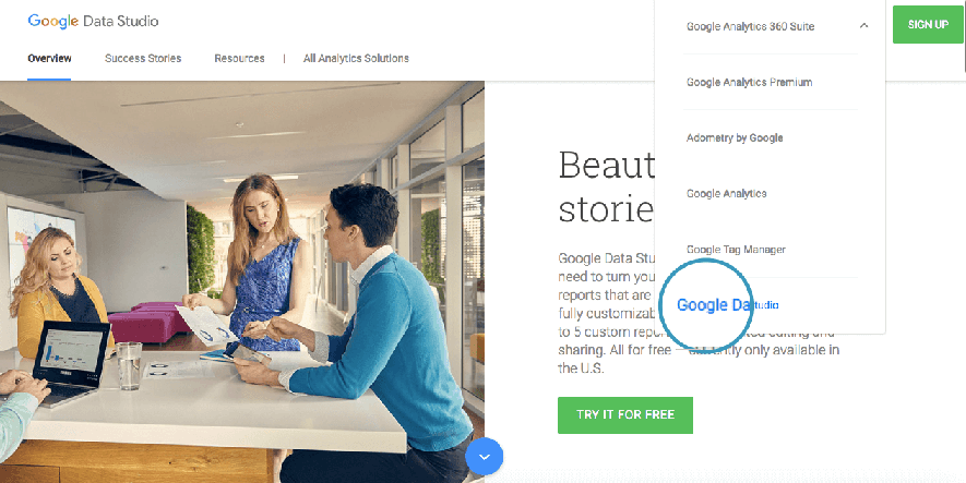
What is Google Data Studio?
Google Data Studio makes it possible for you to transform data into beautiful, informative and interactive reports that stand out, by linking and gathering data from Google Analytics, Youtube, Adwords Campaigns, Google Sheets and many others. Also, you can import several other external data using Google Sheets, be it your latest Facebook marketing campaign or customers demographics.
How to create your first Google Data Studio report
Now, let’s create your first visual analytics report with Data Studio.
Step 1: Visit Google Data Studio and sign in with your Google Analytics Credentials.
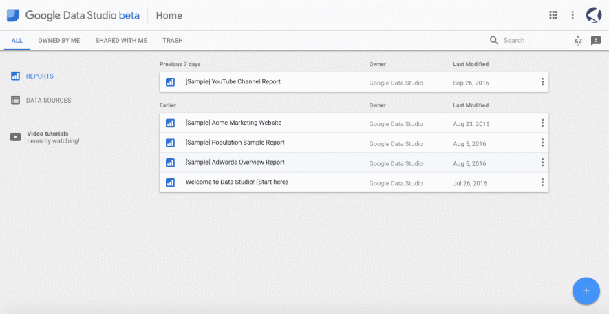
Step 2: When the session is open, you will be redirected to the screen below showing some report samples. Here you can add new reports, data sources and view the step by step tutorial. Take your time to visualize some samples to familiarize yourself with this tool.
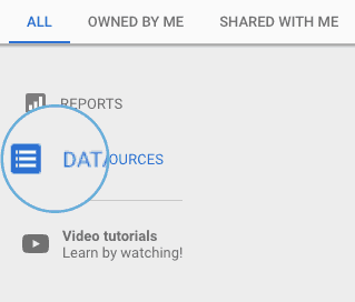
Step 3: Next, add a new data source by clicking the “Data Sources” button at the top left corner.
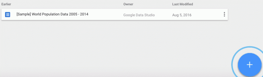
Step 4: In the Data Sources panel, click on the floating “Add” button to link your Google Analytics with Data Studio.
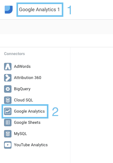
Step 5: On the next screen, add a name for your data source and choose Google Analytics in your list of “Connectors”. You will then be directed to an authorization process to link the most relevant Google Analytics property.
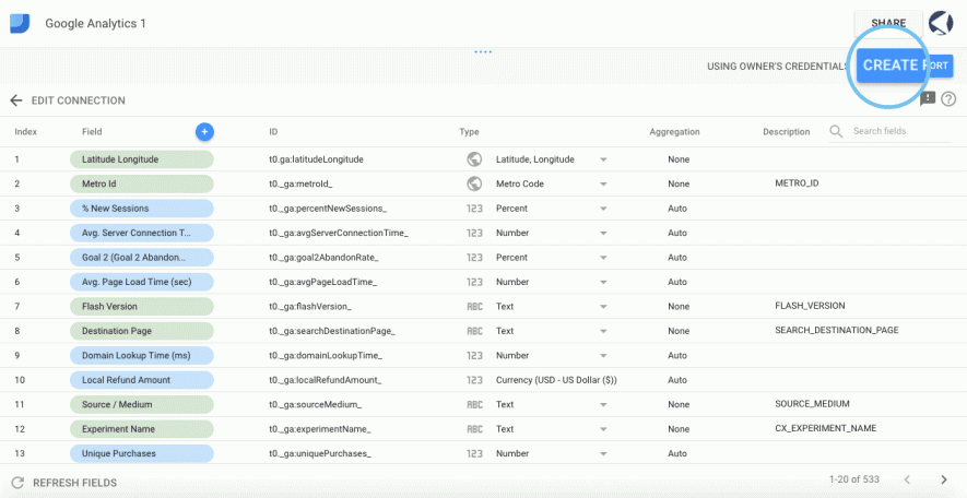
Step 6: Next, you will be directed to the list of metrics available for your report. You can add new formulas or delete existing ones.
When you’re done, click on “Create Report” at the top, in the right corner.
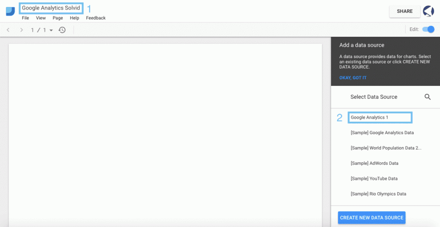
Step 7: You will then be directed to the screen where the magic happens. Give your report a name and select the data source you just created.
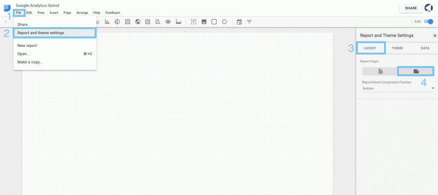
Step 8: Then you’ll see canvas to which you can add elements, text, and styles to personalize your report. However, first, change the orientation of the page to Landscape by choosing “File”> “Report and theme Settings”> “Layout”> “Landscape”.
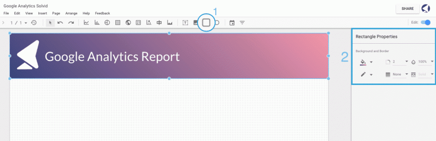
Step 9: Now, let’s add style and personality to your report. Start with a rectangular tool to draw the header. You can, then, customize the colors, import your logo by clicking on the image tab and add a header using the text tool.
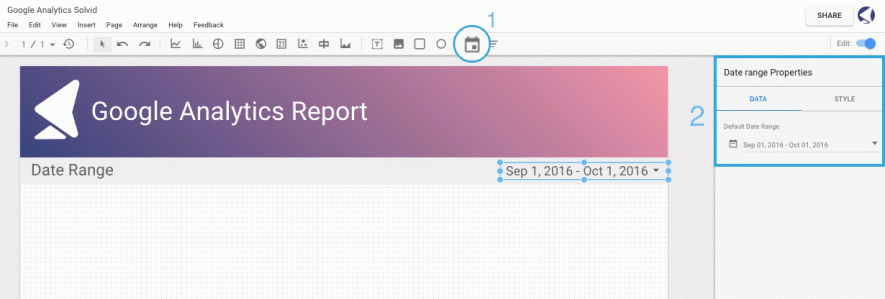
Step 10: Now, let’s continue by adding the current visual data. Start by adding an interactive date range to your report which will allow you to compare data from selected date ranges.
Click on the “Date Range” tab and draw on the canvas where you want it to appear. Then, select a default date range and select your style preference.
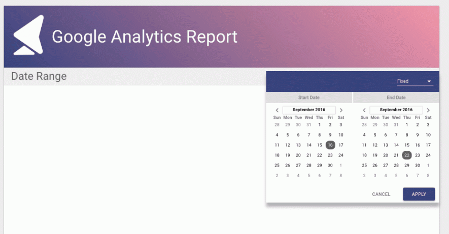
When you share your report, your customers and colleagues will be able to select a custom date range and view the data by that date.
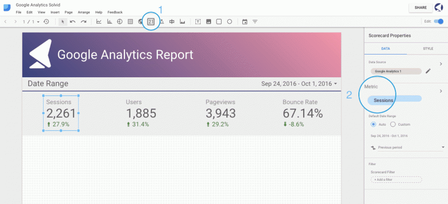
Step 11: Now, let’s add some scorecards to illustrate the data, by sessions, users, page views, and bounce rate. Click on “Scorecard” and select the space where you want it to appear. Then, in the bar on the right, select the metric measure to use for that particular sheet and choose your style preference. Repeat this for each record.
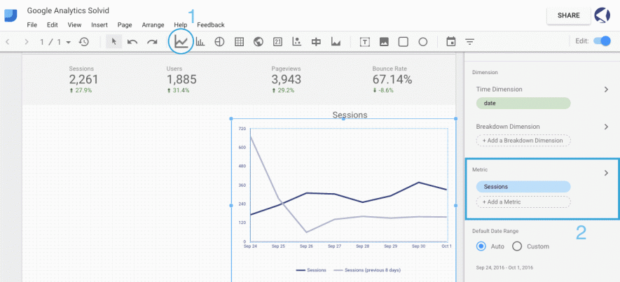
Step 12: Then, add a line graph representing the sessions of your website. Use the “Line-series” function to draw a graph and select the metric measure to use. In this example, we used “sessions”.
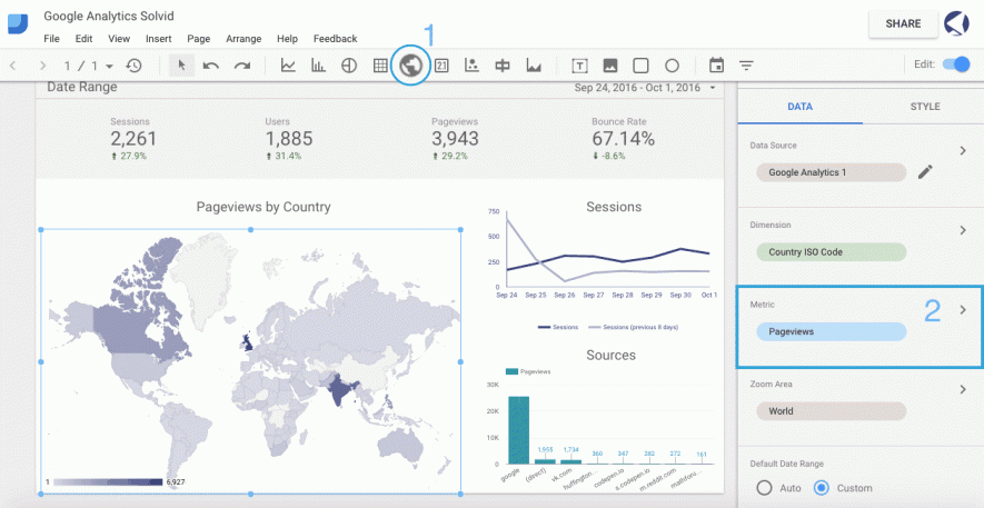
Step 13: Finally, add a map of your pageviews by Country. As we did with the line graph, click on the “Geo map” tab and select where you want it to appear. Then, select pageviews in the “Data” section in the menu on the right.
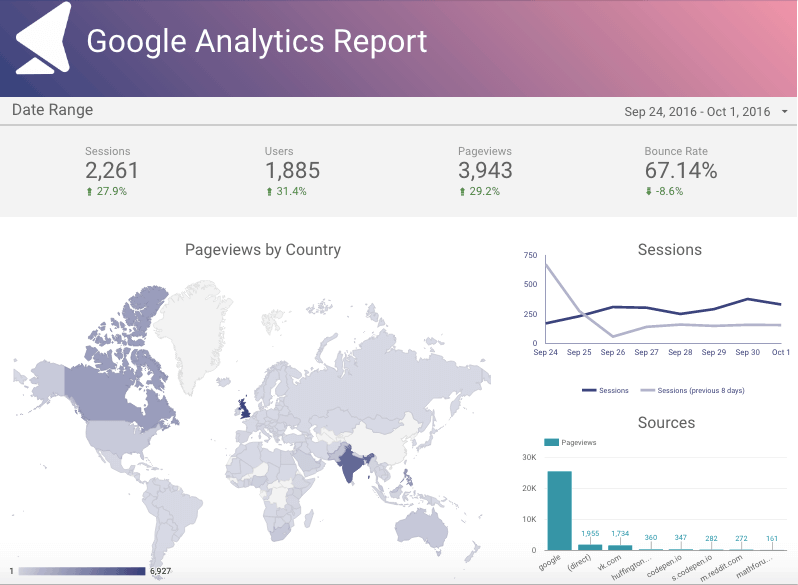
Here is what your report will look like:
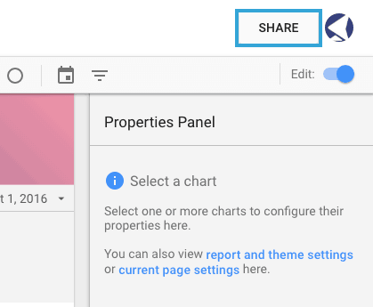
Step 14: Your report is ready. Now it’s time to share it with your customers and colleagues.
Click on the “Share” button at the top, in the right corner.
Get a sharing link and/or enter the email address of the person to whom you wish to send your report.
Do you need help with your dashboard? We are experts at Google Data Studio.
Source: Article original en anglais sur semrush.com